The debate between low-carb eating and balanced nutrition has run for decades. Most of it is theoretical, built on studies, opinions, and whatever podcast happens to be trending that month. A continuous glucose monitor changes the conversation because it turns theory into personal data. Your iCan CGM shows you exactly how your body responds to what you eat, meal after meal, day after day.
What Your Glucose Curve Really Shows
Before comparing eating patterns, it helps to understand what a healthy response to food looks like. A typical glucose curve after a meal rises within the first hour, peaks somewhere between 30 and 60 minutes, and returns close to baseline within two hours. Steep spikes followed by sharp drops are the pattern most people want to avoid, because those swings usually line up with hunger, fatigue, and cravings later in the day.
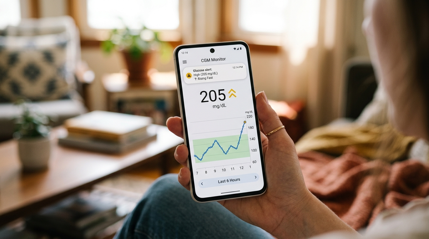
The iCan CGM tracks this rise and fall in real time. Once you have two or three weeks of readings, patterns become clear. Some meals barely move the line. Others send it climbing past 160 mg/dL and then crash it just as quickly.
What Low-Carb Eating Looks Like on Your Sensor
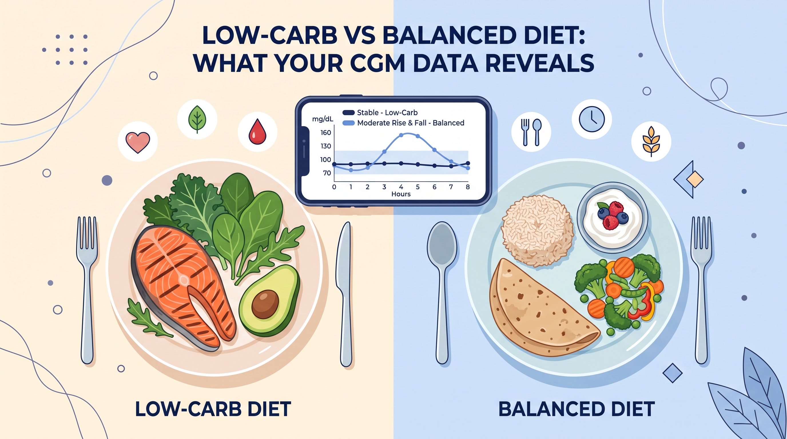
People eating low-carb usually see flat, calm glucose curves. When carbohydrate intake stays under about 50 grams per day, less glucose enters the bloodstream at any given time. Your graph often stays inside a narrow range for most of the day, with only mild rises after protein and fat heavy meals.
The upside is stability. Fewer spikes tend to mean fewer crashes, and many CGM users report steadier energy and clearer focus once their body adapts. The downside shows up during exercise. Endurance during high intensity workouts can dip for the first few weeks while the body learns to burn fat as its main fuel source. If your graph drops into the low 70s during a workout and takes an hour to recover, that is a signal to look at your intake around training.
What a Balanced Diet Looks Like on CGM
A balanced plate that includes complex carbs, protein, fat, and fiber produces a very different graph. You will see a gentle rise, a rounded peak, and a smooth return to baseline. The key word is balanced. A bowl of white rice on its own hits harder than the same rice served with grilled chicken, yogurt, and a side of vegetables. The other foods slow digestion and soften the curve.
The advantage of balanced eating is variety. You get more fiber, more micronutrients, and more flexibility in social settings. The trade off is that your response to carbs depends heavily on pairing and portion size. A CGM helps you learn which combinations work for your body and which ones send you into a two hour crash.
What the Data Actually Tells You
Neither approach wins on paper. What matters is your personal response, and this is where the iCan CGM earns its place on your arm. Two people can eat the same meal and record completely different curves. Sleep, stress, movement, hydration, and even the time of day all shift the response.
Rather than picking a side, use your data to answer specific questions. Does oatmeal spike you more than sourdough? Does chicken biryani hit harder than a rice and daal plate? Does a walk after dinner flatten the curve? These are the questions your monitor can answer for you within weeks.
Making the Right Choice for Your Body
The right approach is the one your CGM data supports. If low-carb keeps your readings steady and your energy stable, that is your answer. If a balanced plate with the right pairings keeps you in range and feeling good, that also works. Trust the graph over the trend. Your iCan CGM does not have an opinion, and that is exactly what makes it useful.