The screen on your iCan CGM app shows a lot at once. Lines, numbers, arrows, colored zones, and shaded ranges can be overwhelming in the first week. Once you know what each element means, the graph becomes one of the most useful health tools you will ever carry in your pocket. This guide walks you through how to read your data so it starts working for you instead of just filling the screen.
The Basics of Your Glucose Chart
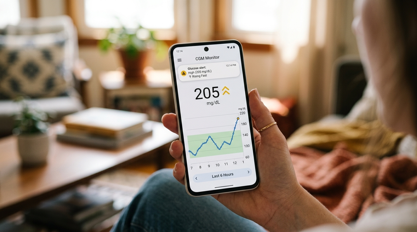
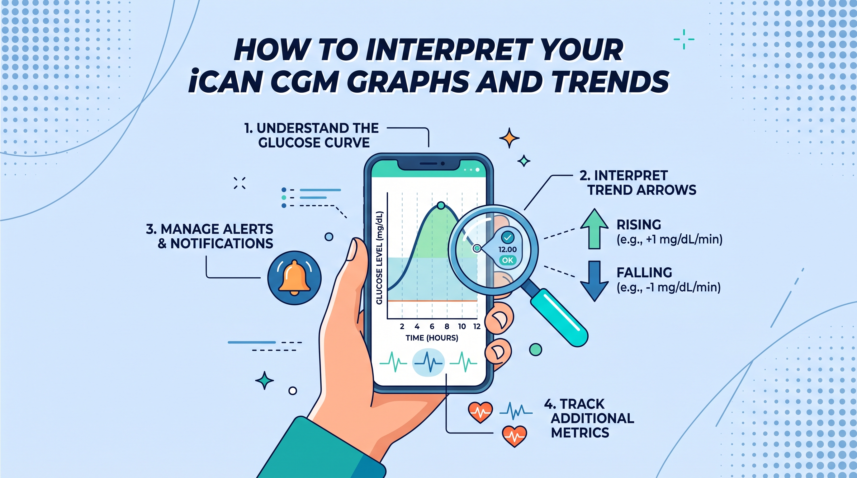
Your main graph shows glucose readings across time. The vertical axis is your glucose level, usually measured in mg/dL. The horizontal axis is time, and most CGM apps let you switch between a 3 hour, 6 hour, 12 hour, and 24 hour view. The current reading sits on the far right, and the line trailing behind it shows where you have been.
A steady, mostly flat line is what you are trying to see. Small rises and falls are normal, especially around meals and workouts. Sharp climbs and steep drops are worth paying attention to, because they usually point to a food, drink, or lifestyle factor that your body is struggling to handle smoothly.
Reading the Trend Arrows
Trend arrows tell you where your glucose is heading in the next few minutes. A steady horizontal arrow means your reading is stable. An arrow pointing up means your glucose is rising, and the steeper the angle, the faster the climb. The same applies to arrows pointing down.
Two arrows in the same direction usually mean a rapid change. If you see double arrows pointing up right after a meal, it is a strong signal that the food you ate is causing a fast spike. Double arrows pointing down are more urgent, because a fast drop can leave you feeling shaky, weak, or lightheaded within minutes.
Time in Range Explained
Time in range is one of the most useful numbers on your iCan CGM. It shows the percentage of the day your glucose stayed inside your target zone, usually between 70 and 140 mg/dL for people without diabetes and 70 and 180 mg/dL for those managing diabetes.
If your time in range is 80 percent or higher, your body is handling glucose well most of the time. If it drops below 60 percent, it usually means either the highs or the lows are pulling your average out of balance. Rather than obsessing over individual readings, watch this number week by week. Small changes in your food, sleep, and movement will show up here first.
Post Meal Peaks and What They Mean
The rise after a meal is your body's most honest signal. A healthy response climbs within the first hour, peaks between 30 and 60 minutes, and comes back close to baseline within two hours. If your peak is higher than 160 mg/dL, or if you are still elevated three hours after eating, the meal was a heavy load for your body.
Note the shape of the curve. A tall, sharp spike followed by a fast drop is often what causes cravings and fatigue an hour later. A rounded, gentle rise means the meal was balanced enough for your system to absorb without stress.
Overnight Patterns and the Dawn Rise
Your overnight graph tells you a lot about your metabolic health. A calm, flat line through the night is what you want. A steady climb toward morning is called the dawn phenomenon, and it happens because your body naturally releases hormones that push glucose up before you wake. A small rise is normal. A steep climb from 90 mg/dL at midnight to 140 mg/dL by six in the morning is worth discussing with a doctor if it repeats.
Sudden drops during sleep are another pattern to watch for. These often follow days with heavy exercise, alcohol, or skipped meals.
Weekly and Monthly Trends
Zoom out on your iCan CGM app once a week. Look for patterns across days rather than single readings. You may notice that Mondays run higher because of weekend eating. You may notice that days with morning walks show flatter afternoon curves. These weekly patterns are where the real learning happens, and they are what turn your CGM from a gadget into a health tool.
Learning to Trust the Line
The graph is a mirror, not a judge. Some days will look messy, and that is fine. The point is to spot the patterns your body keeps repeating and to use them to make better choices. Once you can read your iCan CGM at a glance, you stop reacting to every reading and start responding to the trend, which is where the value of the sensor really shows up.